Covid-19 Tools
In late February when the realization of a looming pandemic hit, I started building several internal tools for our newsroom to help track the spread.
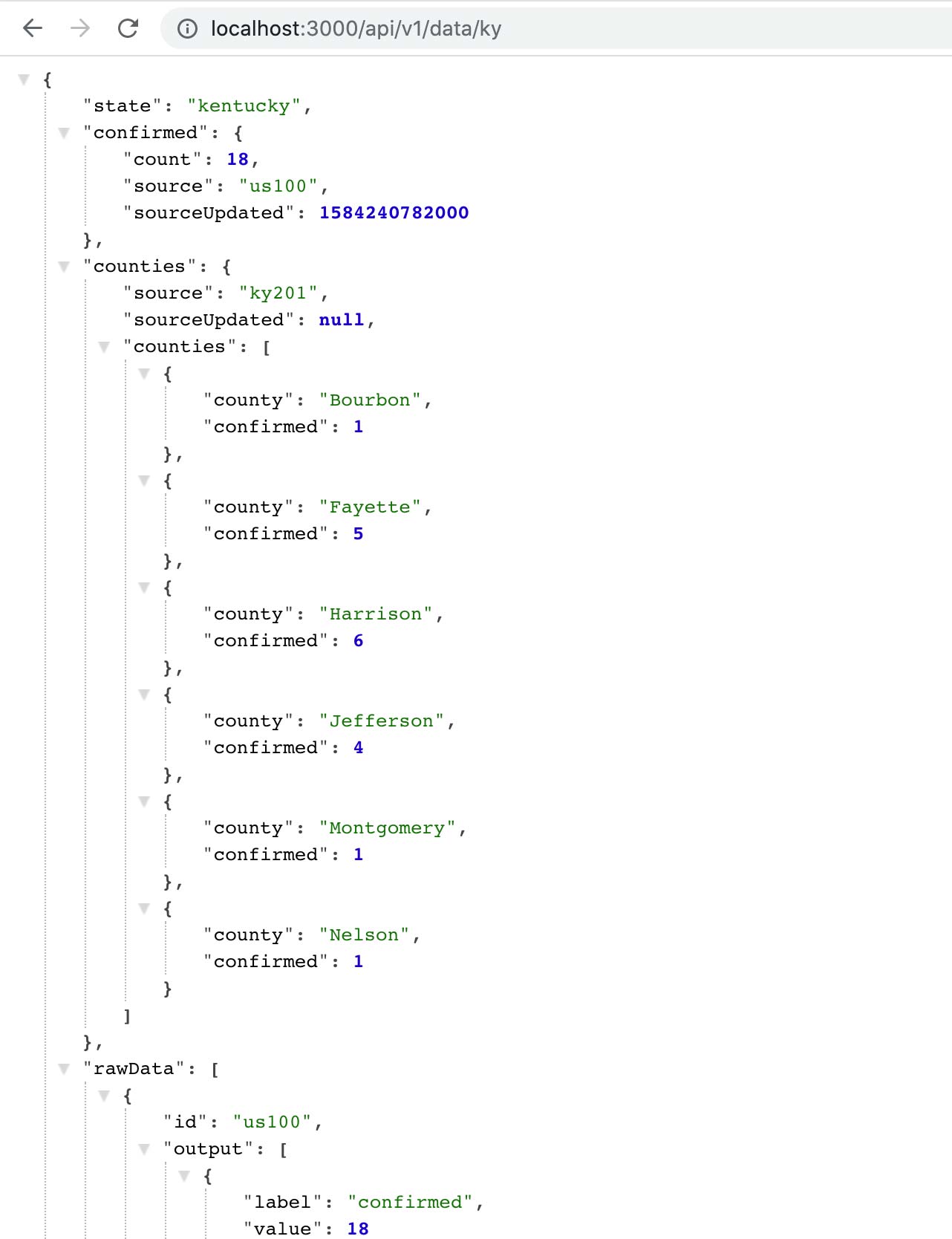
I built one of the first API’s that scraped and aggregated multiple sources of data into a consistent format useful for ingestion into other apps and analysis programs.
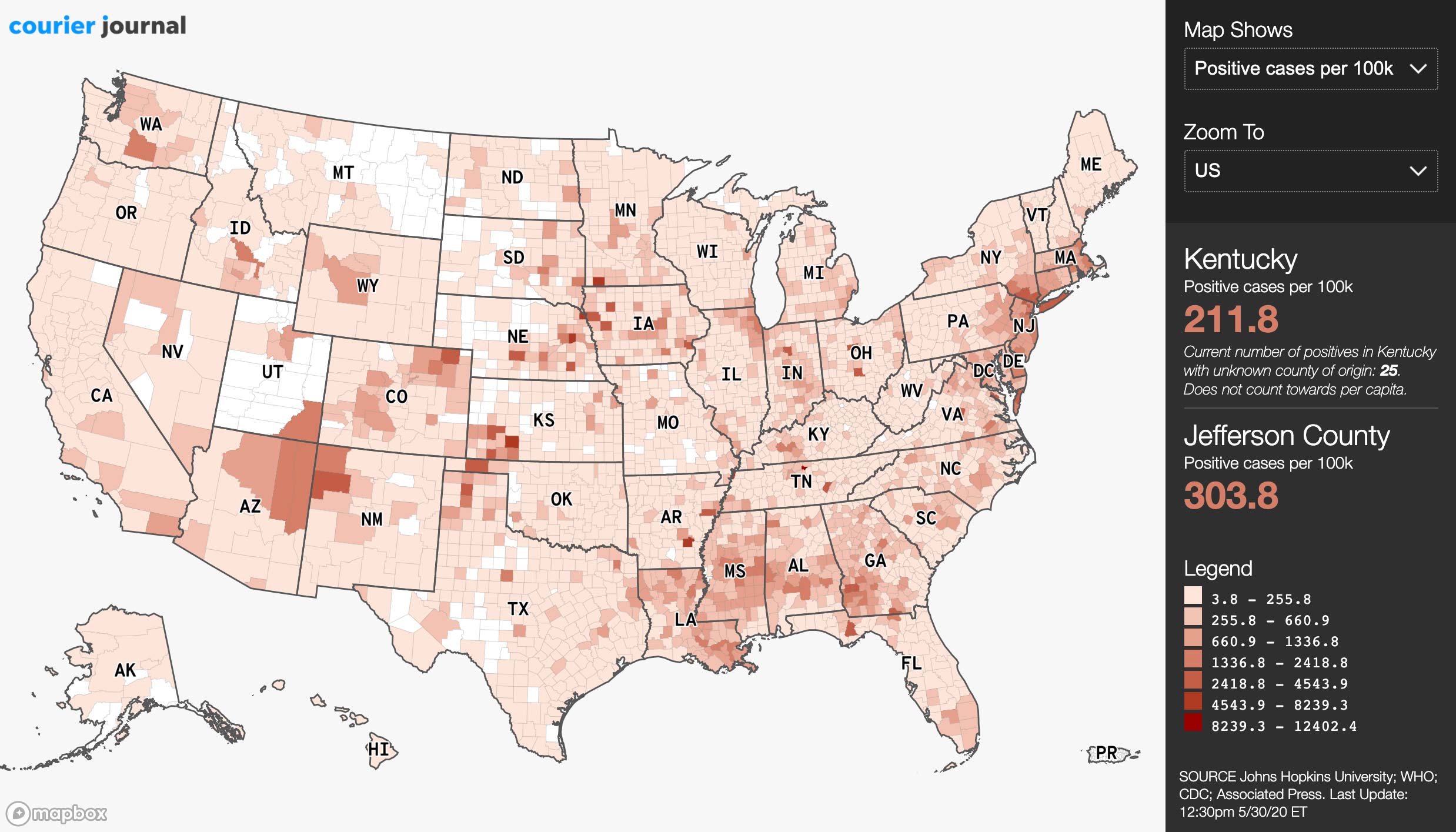
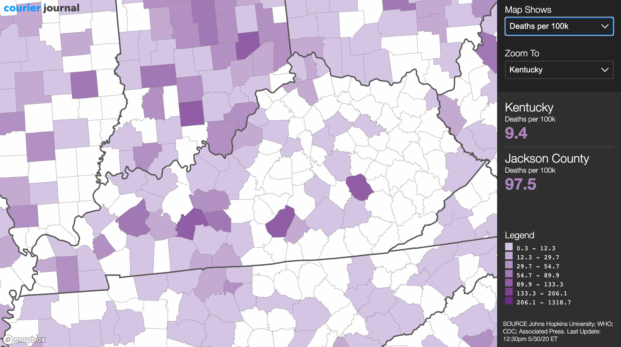
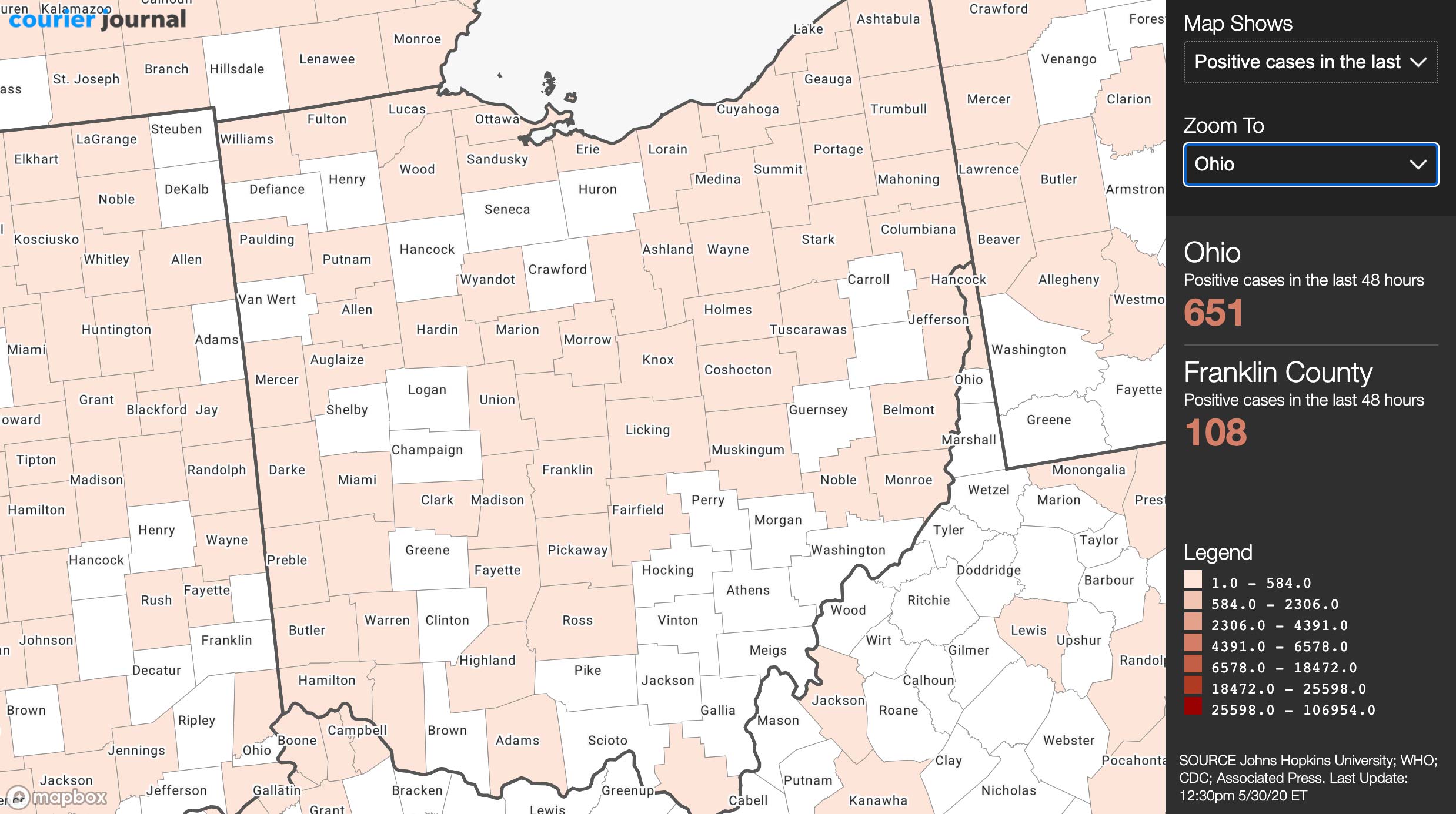
Several maps sprang up quickly, most notably the one built by Johns Hopkins University. But the lack of normalization for per capita rates meant that they didn’t tell the full story. So I built an interactive one that normalized confirmed rates and deaths per county by total and by the last 48 hours. This helped our team get a better handle on what hotspots were occuring and where.
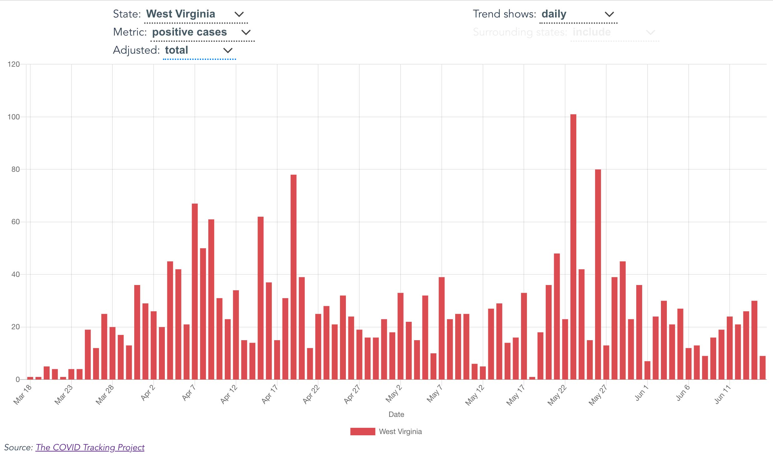
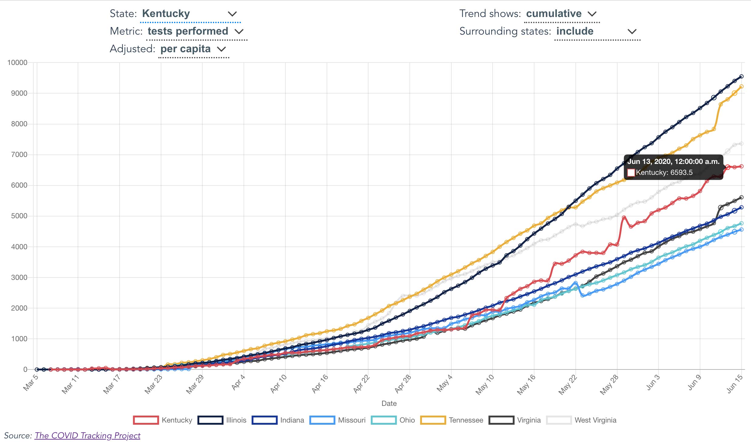
Testing data was available, but fragmented and not easily compared so I built a chart that helped visualize how and if the curve was flattening relative to any state and its surrounding states.